Composition is the arrangement of visual elements within a thumbnail frame. A well-composed thumbnail guides the viewer's eye to the most important element face, object, or text within the first 200 milliseconds of exposure, before any conscious decision-making occurs. A poorly composed thumbnail divides attention across competing elements and produces a weaker click impulse.
YouTube thumbnails are small. At MQ resolution (320×180 px), complex compositions become unreadable noise. Every composition decision must be made with small-scale display in mind. The principles below are not subjective aesthetic preferences they are tested patterns from photography, film, and user interface design that consistently produce higher-performing thumbnails.
For the foundational design rules that complement composition, see the YouTube thumbnail best practices guide and the thumbnail design tips guide.
The Rule of Thirds in YouTube Thumbnails
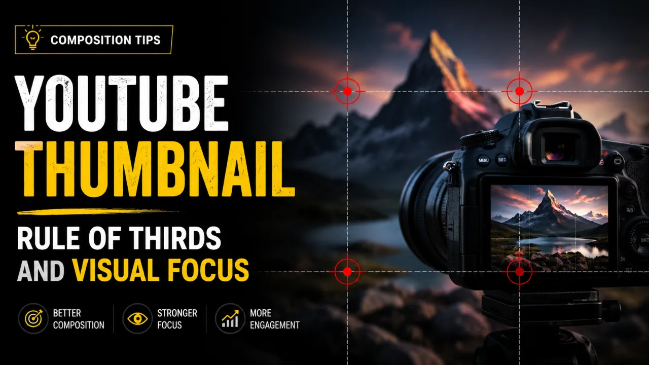
The rule of thirds divides the thumbnail frame into a 3×3 grid using two horizontal and two vertical lines. The four points where these lines intersect called "power points" are where the human eye naturally travels first when viewing an image. Placing your primary subject at one of these four points makes the composition feel natural and draws attention to the right element.
To apply the rule of thirds to a YouTube thumbnail:
- Imagine (or enable) the grid in your design tool. In Canva, toggle "View → Show rulers and guides." In Photoshop, go to Edit → Preferences → Guides, Grid, & Slices and set grid lines to 33.33%.
- Place the subject's face or the most important object near one of the four intersection points not dead centre.
- Allow the remaining two-thirds of the frame to provide context, background, or secondary elements.
Central placement putting the subject exactly in the middle of the frame is the most common composition mistake in thumbnail design. It feels intuitive but produces thumbnails that look static and passive. Off-centre placement creates visual tension that is more engaging and feels more dynamic even when the subject is stationary.
The rule of thirds is a guideline, not a law. Some of the most effective thumbnails in gaming and reaction content use deliberately central placement of a close-up face filling the entire frame at that scale, the face itself becomes the composition rather than an element within it. Understand the rule before breaking it intentionally.
Focal Subject Placement and Visual Hierarchy
Every thumbnail should have one primary focal point the single element that the viewer's eye reaches first. In most creator thumbnails, this is a face or a key object. Visual hierarchy is the ordering of elements by visual weight, which guides the viewer's eye through the composition in the intended sequence: primary subject first, secondary element second, text third (or simultaneously with the primary subject).
Faces and eye contact: Human faces are the strongest natural focal point in visual media. The human visual system is neurologically primed to detect faces including at small display sizes where other details are lost. A face on a thumbnail is processed by viewers faster than any other element. Within faces, the eyes are the strongest sub-element. A face looking directly at the camera establishes eye contact with the viewer, creating a personal connection that motivates clicking. Faces looking away from the camera provide less pull they signal that something else in the frame is more important, and the viewer's eye follows the gaze.
Leading lines: Visual lines within the image that point toward the primary subject increase the strength of that focal point. An arm pointing toward text, an arrow, a road or beam of light converging on the subject these are leading lines. They can be natural (a perspective shot with converging lines) or designed (a graphic arrow added in post). Leading lines are particularly useful when the primary subject is positioned in a corner of the frame.
Scale contrast: A large element next to small elements focuses the eye on the large element automatically. Placing a large face beside small background elements, or oversizing key text relative to secondary text, creates scale hierarchy that guides the viewer's eye without requiring them to consciously assess which element is most important.
Text Placement and the Natural Reading Pattern
English-language viewers scan images in a pattern that research has characterised as an "F-shape" beginning top-left, sweeping right, then scanning down the left edge. Placing your most important text at the top-left or upper portion of the thumbnail puts it in the path of this natural scan pattern.
The lower-right corner is the weakest position for text on a YouTube thumbnail. It is the last area the eye reaches and, on mobile devices, is frequently obscured by the video duration badge that YouTube overlays on all thumbnails. Place no critical text in the lower-right 20% of the thumbnail frame.
Common effective text positions:
- Upper-left: First to be scanned, strongest position for category or hook text
- Upper-right: Strong if the face is on the left the eye moves from face to text naturally
- Lower-left: Safe from the duration badge; works well with large display text below a face
- Across the bottom third (excluding lower-right corner): Works for single-line bold text with high contrast
Text amount: limit thumbnail text to three to five words maximum. Any more and the font must shrink below the readable threshold at MQ (320×180) resolution. The thumbnail's job is to create enough curiosity and context to prompt a click the video title does the remaining explanatory work. Do not try to explain the full video in the thumbnail text.
Advanced Composition Techniques
Negative space: Leaving open, uncluttered space in part of the frame gives the primary subject room to "breathe" visually and reduces the cognitive load of parsing the thumbnail. High-performing thumbnails from educational and premium content channels frequently use large areas of solid color or simple background as negative space. This is the opposite of the "cramming everything in" tendency that produces cluttered, low-contrast thumbnails.
Depth and layering: Thumbnails that include elements at multiple depths foreground, midground, background read as more visually rich than flat, single-plane designs. Blurring the background behind a sharp subject (bokeh effect) naturally separates the focal subject from the background and adds a sense of professional photography quality. This technique is as effective at 320×180 as it is at full resolution because the contrast between sharp and blurred elements is preserved even at small sizes.
Colour blocking: Dividing the thumbnail into large zones of distinct color creates composition through color rather than through element placement alone. A half-red, half-blue thumbnail with a face at the divide is using color blocking for composition. This technique originated in political and news photography and has become standard in high-energy YouTube niches.
Before-and-after split: For transformation content (fitness, home improvement, design, cooking), a vertical or diagonal split showing before on one side and after on the other is a proven thumbnail composition that immediately communicates the video's value proposition. The composition makes the video's outcome visible before a single second of video plays.
Test your composition by exporting or previewing the thumbnail at 320×180 pixels the smallest size YouTube uses. If the primary focal subject is immediately clear and text is readable at that size, the composition works. If either fails, increase the visual weight of the primary element or simplify the number of competing elements. You can download your own previous thumbnails using the thumbnail extractor to compare compositions before and after changes.
To apply these composition rules on a real canvas, the free YouTube Thumbnail Maker lets you position your subject and text on a 1280×720 frame.
Avoiding composition errors is half the battle; see the full list of common thumbnail mistakes to steer clear of.
Frequently Asked Questions
The rule of thirds divides the thumbnail frame into a 3×3 grid with two horizontal and two vertical lines. Placing the primary subject near one of the four intersection points — rather than dead centre — produces a more visually engaging composition. Most major design tools (Canva, Photoshop, Figma) include a grid overlay option to apply this principle during design.
The most effective positions for faces are slightly off-centre, near one of the rule-of-thirds intersection points. For thumbnails with both a face and text, a common pattern is face on the left third and text on the right — the viewer sees the face first (the strongest focal element) and then reads the text as the eye moves right. Always orient the face to look toward the text or toward the centre of the frame, not off the edge.
Focus on contrast (between the thumbnail and surrounding thumbnails) and simplicity (one dominant focal element that is immediately recognisable at small scale). High-contrast color combinations, a large face or primary object, and minimal text all contribute to standing out. Research competitor thumbnails in your niche using the YTI downloader — if every competitor uses dark thumbnails, a light thumbnail stands out; if every competitor uses faces, a different object approach may differentiate you.
Central text placement produces thumbnails that feel static and passive. Off-centre text — upper-left, upper-right, or across the lower portion of the frame (excluding the lower-right corner, obscured by the duration badge) — performs better in most cases. Avoid placing any critical element in the lower-right 20% of the frame.
Three elements is a useful guideline: primary focal element (face or key object), supporting visual context, and text. More than three competing elements produces clutter that reduces the thumbnail's visual impact at small display sizes. Every element you add divides the viewer's attention. Start with one primary element and add only what serves a clear purpose.
Preview or export the thumbnail at 320×180 pixels (the MQ display size) and ask: what is the first thing your eye goes to? Is it the intended primary element? Is the text readable? If the answer to either is no, the composition needs adjustment. The best objective test is A/B testing via YouTube Studio's Test & Compare feature — which shows the actual thumbnail to a subset of your audience and reports CTR data. See the A/B testing guide for the full process.
Visual hierarchy is the ordering of elements by visual weight — size, contrast, color, and position — so the viewer's eye travels through the composition in the intended sequence. A thumbnail with strong visual hierarchy leads the eye directly to the primary focal subject, then to secondary elements, in a logical order. Without hierarchy, all elements compete equally for attention and the thumbnail reads as visual noise rather than a clear composition.