Most YouTube thumbnail mistakes are not design failures they are information gaps. Creators who have not analysed why thumbnails perform well or poorly will repeat the same errors across hundreds of videos, consistently suppressing CTR and limiting the distribution that their video quality deserves.
The ten mistakes below account for the majority of underperforming thumbnails across all niches. Each one is fixable, and fixing it produces immediate, measurable CTR improvement. For the foundational design principles that prevent these mistakes from occurring, see the YouTube thumbnail best practices guide.
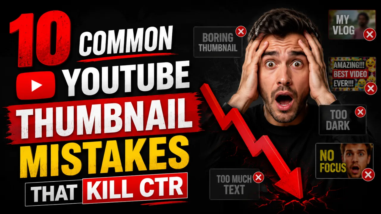
Mistake 1: Too Much Text
More than five words on a thumbnail forces text size down to below the legibility threshold at MQ (320×180 px) resolution the display size on mobile. At that size, small text becomes indistinguishable noise. The viewer's eye skips the thumbnail without processing the message.
Fix: Limit thumbnail text to three to five words. The video title handles full description the thumbnail text should add a hook, confirm the topic, or create curiosity. If you cannot reduce to five words without losing the meaning, rephrase. "How to Lose 10 Pounds in 30 Days Without Going to the Gym" becomes "10 lbs in 30 days."
Mistake 2: Uploading at the Wrong Resolution
Thumbnails uploaded below 1280×720 pixels force YouTube to upscale the image. Upscaling interpolates pixels and produces a soft, blurry result visible at every display size, worst at MQ. Some creators export thumbnails at screen resolution (72 PPI) at 640×360 or smaller, not realising the resulting file is too small for clean CDN output.
Fix: Always design and export at 1280×720 pixels minimum. Use design tool templates: "YouTube Thumbnail" in Canva is pre-set to 1280×720. In Photoshop or Figma, create your canvas at 1280×720 or 1920×1080 from the start. Check the thumbnail size guide for all specifications.
Mistake 3: Low Contrast Text
White text on a light background and dark text on a dark background are invisible at thumbnail scale. This is the single most common cause of "looks fine on my screen" thumbnails that perform poorly. The creator sees the thumbnail at full resolution on a large monitor, where the slight contrast differential between text and background is perceptible. Viewers see it at 320×180 on a phone, where it is not.
Fix: Add a 24 px black or white stroke to all text. Or place a semi-transparent dark panel behind white text. Or use black text only on near-white areas of the background. Test at 320×180 if text is not clearly readable at that size, it is not readable enough. See the thumbnail font guide for legibility techniques.
Mistake 4: Misleading Clickbait Thumbnails
Thumbnails that exaggerate, misrepresent, or have no relationship to the video content the classic "clickbait" pattern produce a short-term CTR spike followed by a collapse in watch time and audience retention. YouTube's algorithm measures satisfaction after the click, not just the click itself. Videos with high CTR but low average view duration are penalised in distribution. Viewer disappointment also generates dislikes, negative comments, and "don't recommend" feedback, all of which further suppress distribution.
Fix: Design thumbnails that accurately represent the video's most interesting or surprising true content. The goal is to attract the right viewers those who will watch and be satisfied not to maximise raw clicks from mislead viewers who will immediately leave.
Mistake 5: No Clear Focal Subject
Thumbnails with multiple competing elements three separate photos, a collage, six graphics of equal size have no visual hierarchy. The viewer's eye has nowhere to go first. Without a clear focal subject, the brain processes the thumbnail as visual noise and moves on. At MQ resolution, a cluttered thumbnail becomes an unreadable blob.
Fix: Every thumbnail needs one primary focal element a face, a single key object, or a clear scene. Secondary elements support the primary but do not compete with it in size or visual weight. Apply the rule of thirds to place the primary element at a power point. See the thumbnail composition guide for the full framework.
Mistake 6: Inconsistent Channel Branding
Thumbnails that have no visual relationship to each other different colour palettes, different fonts, different layouts video-to-video fail to build channel recognition. When a subscriber scrolls past a familiar colour and font combination on the YouTube homepage, they identify the content as yours before reading anything. That recognition shortcut increases CTR from existing subscribers. Without consistency, every thumbnail must earn the click from scratch, even with loyal subscribers.
Fix: Define a consistent palette of two to three colors and one or two fonts used across all thumbnails. Use a template in Canva or Figma that locks the color scheme and font choices while allowing the image and text to change per video. Existing subscribers should recognise your thumbnails from colour and composition alone.
Mistake 7: Placing Critical Elements in the Lower-Right Corner
YouTube overlays the video duration (e.g., "12:34") in the lower-right corner of every thumbnail on the homepage, search results, and suggested video surfaces. Any text, face, or graphic element placed in the lower-right 1520% of the thumbnail frame will be partially or fully obscured by this overlay invisible to every viewer who sees the impression.
Fix: Keep all critical elements face, key text, objects out of the lower-right corner of the frame. Use the lower-left, upper areas, or centre-right as safe zones. See the composition guide for safe placement zones.
Mistake 8: Using a Screenshot as the Source File
A screenshot of a design tool, a YouTube page, or a finished thumbnail is already a compressed, low-resolution copy of the original. Using it as the source file for a new thumbnail adding text, editing, or re-exporting adds further compression degradation on top of the existing quality loss. The result is a soft, blurry thumbnail with visible JPEG artifacts.
Fix: Always work from the original design file (Canva project, Photoshop PSD, Figma file, raw photograph) and export to JPG as the final step. Never use a screenshot as a thumbnail source. For more on how compression works and how to prevent it, see the thumbnail compression guide.
Mistake 9: Ignoring Mobile Display Sizes
Thumbnails designed and reviewed on a 27-inch monitor at full resolution look very different from those same thumbnails on a 6-inch phone screen at 320×180 px. Elements that seem substantial on a large screen become tiny or illegible at mobile scale. Since YouTube's audience is 53% mobile by session count, a thumbnail that only works on desktop is a thumbnail that fails for more than half of viewers.
Fix: After finishing your thumbnail design, export or preview it at exactly 320×180 pixels and view it on a phone screen. This is the real-world legibility test. Alternatively, zoom out your design tool until the thumbnail appears at roughly 320×180 on screen and evaluate from that view. Any text that is not clearly readable at that size needs to be larger, bolder, or removed.
Mistake 10: Never Testing Alternative Thumbnails
Many creators design one thumbnail per video, upload it, and move on never knowing whether a different design would have produced significantly more clicks. YouTube Studio's Test & Compare feature allows you to test two thumbnails on the same video with the same audience, measuring actual CTR differences before committing to a permanent thumbnail. Creators who run regular A/B tests consistently produce better-performing thumbnails over time through direct data feedback.
Fix: Before changing a thumbnail, archive the current version using the YouTube thumbnail downloader. Design an alternative, upload it via Test & Compare, and let the data decide. Over time, the patterns revealed by your tests which color works, face vs faceless, text vs no text will inform all future thumbnail decisions. The complete testing workflow is in the A/B testing guide.
Before you publish, run your design through the free Thumbnail CTR Score tool to catch several of these mistakes automatically.
Frequently Asked Questions
Too much text and low contrast are the two most common thumbnail mistakes, often appearing together. Creators add a long title as thumbnail text, which must be set small to fit — and at that small size, low-contrast text on a photographic background becomes invisible at mobile display sizes. The fix is fewer, larger words with a visible contrast treatment (stroke, shadow, or background panel).
This usually means you exported at lower resolution than your design canvas, or you used a screenshot as a source element. Canva thumbnails should be exported as JPG (not PNG, which can be too large) at the default quality. If the canvas is set to 1280×720, the export will be at that resolution. If you used a screenshot or low-resolution image within the design, it will appear blurry after YouTube's compression. See the compression guide for the full diagnosis.
Three to five words is the research-backed limit. Beyond five words, text must be set too small to be legible at 320×180 px. Many of the highest-performing thumbnails in high-energy niches use zero words — relying on the face expression and visual subject to communicate the video's content and emotional hook. If you use text, make it count: every word should be doing work that the image cannot do alone.
Yes — consistent visual branding across thumbnails builds channel recognition that increases CTR from subscribers over time. Define a palette and template and apply it consistently. The content changes per video; the visual system stays the same. Think of it as a brand identity: the logo stays consistent even when the advertisement changes.
In YouTube Studio, check the Impressions Click-Through Rate (CTR) for the video. If CTR is below 2% from the Homepage or Search impression sources, the thumbnail is likely underperforming. Compare to other videos in your upload history — if this video's CTR is significantly lower than similar content, the thumbnail is the first variable to test. Upload an alternative via Test & Compare and measure the difference.
Clickbait that misrepresents the video content is bad for long-term channel health — it attracts viewers who leave quickly, reducing average view duration and signalling poor quality to YouTube's algorithm. Thumbnails that are dramatic, surprising, or exciting — but accurately represent the video content — are effective and appropriate. The distinction is accuracy: exaggerate the real hook of the video, not a hook that does not exist in the content.
YouTube overlays a video duration badge (e.g., "14:23") in the lower-right corner of every thumbnail on all display surfaces. This badge is not controllable by creators. Avoid placing any important visual element — face, text, object — in the lower-right 15–20% of the thumbnail frame. Design as if that area does not exist. The lower-left corner and upper areas of the frame are the safe zones.