Text on a YouTube thumbnail has one job: to be instantly readable at the smallest display size YouTube uses, which is 320×180 pixels on mobile. At that size, a thin-weight font with tight contrast disappears. A bold, high-contrast font with a clear outline remains legible.
Font choice is one of the highest-leverage decisions in thumbnail design. The right font communicates your video's topic before the viewer consciously reads it through weight, letterform, and the emotional association the typeface carries. The wrong font makes text invisible at mobile scale, which eliminates the thumbnail's ability to communicate anything at all.
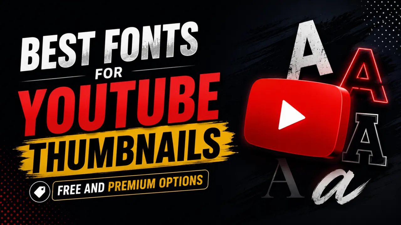
This guide covers the best free and premium fonts for YouTube thumbnails, the technical requirements a thumbnail font must meet, and the rendering techniques that make any font more legible at small sizes. For the broader design principles that govern thumbnail CTR, see the YouTube thumbnail best practices guide.
What Makes a Font Work for YouTube Thumbnails
Before choosing a specific typeface, understand the performance criteria a thumbnail font must meet. A font that looks elegant in a magazine layout may be completely unreadable on a YouTube thumbnail.
Weight: Bold and ExtraBold weights 700 to 900 on the CSS scale are the baseline requirement. Regular and Light weights disappear against photographic backgrounds at small sizes. If your chosen typeface only has a Regular weight, it is not appropriate for thumbnail text.
x-height: Fonts with a large x-height (the height of lowercase letters relative to uppercase) read more clearly at small sizes. A tall x-height means letters like 'a', 'e', and 'o' are bigger relative to the cap height, making them easier to distinguish at MQ (320×180) resolution.
Letterform clarity: Avoid fonts with complex, decorative letterforms at thumbnail sizes. Serifs can work at large point sizes but become illegible at small display sizes. Sans-serif and condensed typefaces generally outperform decorative and script fonts.
Contrast with background: Font colour must be chosen with the background in mind, not the font itself. A white font on a light background and a black font on a dark background both fail. Use a stroke, drop shadow, or background panel behind text to ensure legibility regardless of background colour.
Condensed vs expanded: Condensed fonts (narrow letterforms) allow more characters per line, which lets you fit longer thumbnail text without reducing font size below the legibility threshold. Expanded fonts look bold and impactful but limit how many words fit on a single line.
Best Free Fonts for YouTube Thumbnails
All fonts below are available at no cost on Google Fonts (fonts.google.com) or as free downloads and can be used in Canva, Photoshop, Figma, and all major design tools.
Bebas Neue is the most widely used free font in YouTube thumbnail design. Its all-caps letterforms are wide, bold, and instantly legible at any thumbnail size. The uniform stroke width and minimal decorative detail mean it reads cleanly at 320×180. Best for: high-energy titles, gaming, finance, news-style thumbnails. Limitation: it only has uppercase letters, so any lowercase in your thumbnail text will display as uppercase.
Montserrat ExtraBold / Black is a geometric sans-serif with strong legibility at small sizes. The ExtraBold (800) and Black (900) weights provide maximum impact. Available in both normal and italic styles, making it versatile for emphasis. Best for: lifestyle, education, beauty, personal development content. Works well paired with a thinner weight of the same font for secondary text.
Anton is a condensed display font with very high weight and compact letterforms. It allows more words on a single line than wider fonts like Bebas Neue. Best for: news-style thumbnails, reaction content, titles with many words. Its narrow width means text fills more of the vertical space, which is particularly useful for Shorts thumbnails.
Oswald Bold is a condensed sans-serif with optical corrections that improve legibility compared to older condensed typefaces like Impact. Available in weights from Light to Bold use Bold (700) or ExtraBold for thumbnail work. Best for: documentary style, news, technology, business content.
Black Han Sans is a Korean-origin bold display font with extreme weight and very clean letterforms. Works exceptionally well for thumbnails with a single word or short phrase. Best for: bold single-word titles, dramatic impact thumbnails.
Lato Black (weight 900) is a humanist sans-serif that reads more warmly than geometric options like Montserrat. The Black weight is substantial enough for thumbnail use. Best for: personal brand content, education, cooking, wellness channels where a human and approachable tone matters.
Best Premium Fonts for YouTube Thumbnails
Premium typefaces cost money but provide more character polish, better spacing metrics, and options not available in Google Fonts. These are worth considering for established channels where visual brand consistency matters.
Gotham Black / Ultra (Hoefler&Co) is the gold standard of bold sans-serif typography. Its geometric construction produces exceptionally clean letterforms at all sizes. Gotham is used by presidential campaigns, major media brands, and consumer product packaging its legibility at small sizes is proven. Available via Adobe Fonts (included in Creative Cloud).
Proxima Nova Black / ExtraBold (Mark Simonson Studio) is a hybrid typeface that combines the proportions of geometric sans-serifs with the humanist warmth of classical grotesques. The Black weight is extremely well-rendered at small sizes. Available via Adobe Fonts and Typekit.
Brandon Grotesque Black (HVD Fonts) has slightly more personality than Gotham while maintaining the same clean legibility. Works particularly well for lifestyle, food, and beauty thumbnail design where a premium brand feel is needed alongside impact. Available via Adobe Fonts.
Neue Haas Grotesk Display Bold is a contemporary revival of Helvetica's ancestor, optimised for display use. Its neutral authority reads as credible and trustworthy appropriate for finance, health, and educational content where the aesthetic should not compete with the subject matter.
Font Techniques That Improve Thumbnail Legibility
Beyond typeface selection, these techniques improve how any font reads on a thumbnail background.
Stroke / Outline: Adding a stroke (outline) around text in a contrasting colour typically black on white text or white on dark text separates the letterforms from the background regardless of what is behind them. In Canva, use "Effects → Outline". In Photoshop, use Layer Style → Stroke. A 24 px black stroke on white text makes text readable on any background.
Drop Shadow: A soft drop shadow behind text adds depth separation from the background without the hard line of a stroke. Use black with 5070% opacity, a small blur (48 px), and a small offset (24 px). Drop shadows tend to look more natural than strokes for photographic backgrounds.
Background band / text panel: Place a semi-transparent coloured rectangle behind text. This guarantees contrast regardless of the background image complexity. Common on news-style thumbnails. Opacity of 6080% black lets the background show through while ensuring text legibility.
Limit text volume: Even the best font becomes illegible at thumbnail scale when there is too much of it. YouTube best practice is to use no more than three to five words on a thumbnail. The font does not carry the meaning alone the visual elements provide context, and the text confirms it. For complete design principles, see the thumbnail design tips guide.
Test at MQ resolution (320×180): Before finalising your thumbnail design, export or preview it at 320×180 pixels the size YouTube uses for mobile thumbnails. If text is readable at that size, it will be readable on every device. If it is not, increase font size, add a stroke, or reduce the word count.
Once you have chosen a typeface, you can set it on a live 1280×720 canvas with the free YouTube Thumbnail Maker.
Frequently Asked Questions
Bebas Neue is the most commonly used free font on YouTube thumbnails, particularly for high-energy niches like gaming, finance, and reaction content. Montserrat ExtraBold is the second most popular, favoured by lifestyle, education, and business channels. Gotham Black is the most common premium choice among professional creators and media brands.
Yes — Impact was the dominant thumbnail font before better alternatives became freely available. It is extremely bold and condensed, which makes it readable at small sizes. Its limitations are that it has become strongly associated with meme-format imagery, which may not suit all content styles, and its letter spacing is often too tight at large display sizes. Oswald or Anton are more refined alternatives in the same condensed bold category.
Text on a thumbnail designed at 1280×720 px should be at least 60 px for any text you want readable at the MQ (320×180) display size. Most effective thumbnails use text at 80–120 px for the main line. Test your design at 320×180 before finalising — if text is still clearly readable at that size, it is sized appropriately.
All caps text reads well at thumbnail scale because capital letters are uniform in height, making them distinguishable even at MQ resolution. Mixed case text is more natural and often performs better for educational or professional content where an authoritative tone matters more than energy. For high-impact niches (gaming, reaction), all caps is the convention. Test both on your channel and monitor CTR.
Three to five words is the guideline supported by most creator research. Beyond five words, text becomes too small to read at MQ resolution, or requires multiple lines that compete with the visual elements. Some effective thumbnails use zero words — relying entirely on the image to communicate the subject. Zero-word thumbnails typically require a recognisable subject (face, object, scene) that immediately contextualises the video topic.
Google Fonts (fonts.google.com) provides free, commercially licensed fonts that can be used in Canva, Photoshop, Figma, and all major design tools. All fonts listed in this guide's free section are available there. Adobe Fonts (included with Creative Cloud) provides access to premium typefaces including Gotham, Proxima Nova, and Brandon Grotesque.
Font choice does not directly affect YouTube search ranking. Thumbnails are not parsed for text content by YouTube's algorithm. However, font choice affects click-through rate, and CTR is a significant engagement signal that YouTube's algorithm uses to determine how widely to distribute a video. A more legible, better-contrasted font that increases CTR will indirectly improve distribution. For more on the relationship between thumbnail design and performance, see the YouTube thumbnail CTR benchmarks guide.