A YouTube thumbnail is not decoration it is your video's primary advertisement in a feed of competing content. YouTube's own data shows that over 90% of the best-performing videos on the platform use a custom thumbnail rather than an auto-generated frame. But uploading a custom thumbnail is only the starting point. The design choices you make within that thumbnail directly determine how many people click through to watch your video. These eight design principles are drawn from high-volume YouTube channel data and established visual psychology research.
1. Upload at the Correct Size Before Designing
All thumbnail design work should be done on a canvas set to 1280×720 pixels at 72 DPI (for screen use). This is YouTube's recommended upload size. Working at this exact resolution ensures your design elements text, faces, borders scale correctly when YouTube displays the thumbnail across different device sizes and interface contexts. If your source image is not yet at 1280×720, use the YouTube Thumbnail Resizer to resize it in your browser before importing it into your design tool no upload required.
For detailed design analysis of existing thumbnails, download them at HD (1280×720) using the free YouTube thumbnail downloader. The HD download gives you the highest-resolution version YouTube stores, useful for examining fine design details at full pixel level in Photoshop, Figma, or Canva.
2. Use High Colour Contrast
The YouTube browse grid is a wall of competing visual information. Thumbnails that rely on muted, low-contrast colour palettes disappear into the background. High-performing thumbnails consistently use bold colour contrast: a bright element against a dark background, or a dark element against a light background.
Practical contrast strategies that appear repeatedly in high-CTR thumbnails:
- Bright yellow, orange, or red text on a dark or black background
- A solid colour block behind text to separate it from a busy background image
- A complementary colour pair (blue and orange, red and green) for the primary visual element and background
- A bright outline or drop shadow around text to ensure readability across different background colours
Downloading the top-performing thumbnails in your niche with the YTI tool and placing them side by side in an image editor reveals the colour palette patterns that your target audience is already responding to.
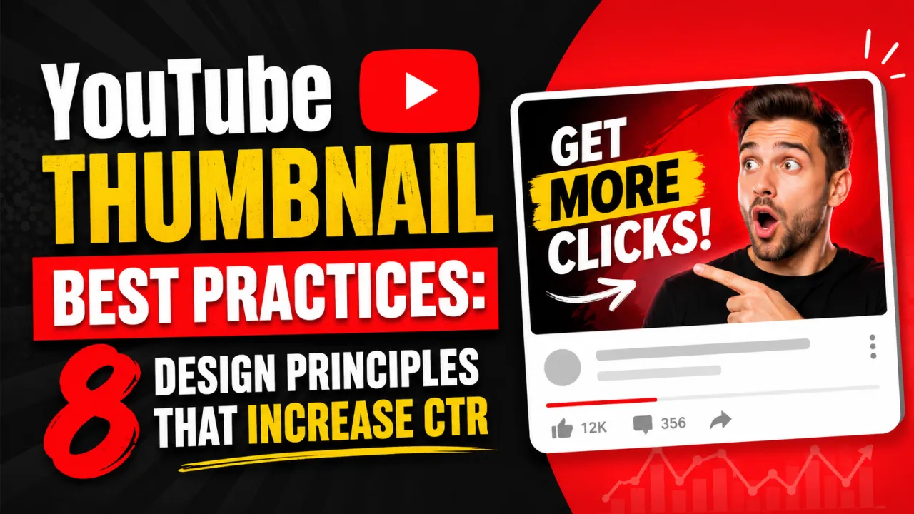
3. Include a Face with a Clear Expression
Human faces are the most powerful attention-drawing element available in thumbnail design. The human visual system is hardwired to prioritise faces in its field of vision a face in a thumbnail creates an immediate connection between the potential viewer and the content.
The face must be large enough to read at thumbnail scale. On a 1280×720 canvas, the face should typically occupy between one-third and half of the frame width. Small faces that are only legible when the thumbnail is viewed at full size lose their attention-drawing function in the feed.
The expression matters as much as the presence of a face. Surprise, curiosity, concern, and excitement are the expressions most consistently associated with high-CTR thumbnails, because they signal that the content contains something unexpected or worth watching. Neutral or flat expressions provide no emotional information and are less likely to drive clicks.
4. Use Minimal, Purposeful Text
Text in a YouTube thumbnail should add context that the title alone does not provide, or reinforce the most important keyword or emotional hook of the video. The standard recommendation is a maximum of three to five words. More text than this becomes unreadable at the small sizes thumbnails are displayed in the mobile browse feed.
Effective thumbnail text principles:
- Use large, bold, high-contrast fonts (thin or serif fonts at small sizes become illegible)
- Do not repeat the video title word-for-word add a number, a result, or an emotional amplifier
- Place text away from the edges of the frame, which are often cropped in some display contexts
- Use a text outline, drop shadow, or solid background block to ensure readability across any background colour
5. Maintain a Consistent Visual Style Across Your Channel
A consistent thumbnail style across your channel serves two functions. First, it builds recognition: viewers who have watched your content before will identify your thumbnail instantly in a crowded feed, even before reading the title. Second, it signals professionalism and intentionality, which correlates with audience trust and subscription rates.
Consistency does not require all thumbnails to look identical. It means maintaining consistent elements: a recurring colour palette, a consistent font choice, a fixed logo or watermark position, and a predictable compositional structure. High-volume channels (500,000+ subscribers) typically develop a visual template and apply it to every video, adjusting only the specific image and text for each video.
6. Study Competitor Thumbnails Before Designing
The most efficient way to identify what visual choices drive click-through rate in your specific content category is to study the thumbnails of the highest-performing videos in that category. This is not copying it is understanding the visual language your audience already responds to.
To conduct thumbnail competitor research:
- Identify the top 1020 videos in your niche by view count using YouTube search sorted by View Count.
- Download their thumbnails in HD using the YouTube Thumbnail Downloader.
- Place all thumbnails on a single canvas in Figma or Photoshop.
- Identify the recurring patterns: dominant colours, face positions, text placement, background styles.
- Design your thumbnail to fit the winning pattern while adding a distinct visual element that sets your video apart.
7. A/B Test Your Thumbnails Using YouTube Studio
YouTube Studio provides a built-in thumbnail A/B testing feature called Test & Compare, available to channels in the YouTube Partner Program. The feature automatically serves two different thumbnail versions to different audience segments and reports which version drives more clicks over a 72-hour test period.
Before uploading a replacement thumbnail for A/B testing, download your current thumbnail using the YTI tool and save it locally. If the replacement underperforms, you have the original file ready to restore. Maintaining a local archive of your previous thumbnail designs is standard practice for creators who test regularly.
8. Optimise the Thumbnail for the Click, Not the View
A common mistake in thumbnail design is optimising for visual appeal at full size rather than performance in the feed at thumbnail size. A thumbnail that looks beautiful as a poster may be completely illegible in the 168×94px rendered size in the mobile browse grid.
Always evaluate your thumbnail at reduced scale before publishing. Most design tools allow you to zoom out to 2533% of the canvas to simulate the browse grid display. At that scale, the essential message face, key text, and primary colour must be immediately readable without any deliberate effort from the viewer.
How to Download Reference Thumbnails for Design Research
The YouTube Thumbnail Downloader by YTI is a free tool for saving thumbnails in HD, SD, HQ, and MQ quality. Paste any public YouTube video URL and download the thumbnail in seconds no account, extension, or sign-up required. Use it to build a reference library of high-CTR thumbnails from your niche before starting any new thumbnail design project.
For Shorts creators, the YouTube Shorts Thumbnail Downloader retrieves vertical 9:16 thumbnails from Shorts videos, which require different design considerations from standard 16:9 thumbnails.
For the inverse of these principles, review the common YouTube thumbnail mistakes that lower CTR.
Frequently Asked Questions
A good YouTube thumbnail combines high colour contrast, a clear focal point (usually a face), minimal readable text, and a design that communicates the video's core value within two seconds of visual scanning. It must remain legible and compelling at the small sizes used in the browse grid on mobile devices.
There is no fixed schedule. Review underperforming videos — those with a click-through rate below your channel average in YouTube Studio analytics — and update their thumbnails first. Many creators A/B test new thumbnails on their top 10 videos by view count annually to identify CTR improvement opportunities.
Text helps when it adds information the face or image alone cannot convey, uses high contrast, and stays under five words. Text hurts when it repeats the video title word-for-word, uses thin or decorative fonts that become unreadable at small sizes, or occupies so much of the frame that it competes with the face or primary visual element.